
Goals and Objective
The overarching objective of "Bank Roll" is to serve as a comprehensive financial hub, providing users with a unified platform to save funds, establish personalized budgets, receive expert financial guidance, and meticulously track all expenditures. Our goal is to create a user-centric, responsive web application that offers seamless money transfers, budget creation, and access to financial education modules. With a focus on intuitive design, Bank Roll ensures a secure and streamlined user experience, eliminating the need to switch between multiple financial tech platforms or websites.
Design Process
User Stories
Overview
In today's dynamic environment, the need for efficient financial management is imperative as individuals save for significant life milestones like weddings, extensive travels, or new car purchases. Although the importance of prudent savings is widely acknowledged, many find the task daunting, especially those with an aversion to financial oversight. The core challenge is the absence of user-friendly tools that demystify financial tracking. There is a pressing need to deliver a seamless, intuitive experience, enabling clear visualization of financial habits and providing actionable strategies to enhance savings within precise timeframes.
Project Duration
4 Weeks
My Role
UI/UX Designer
UI/UX Research
Tools
Figma
Photoshop
Adobe Illustrator
Challenge
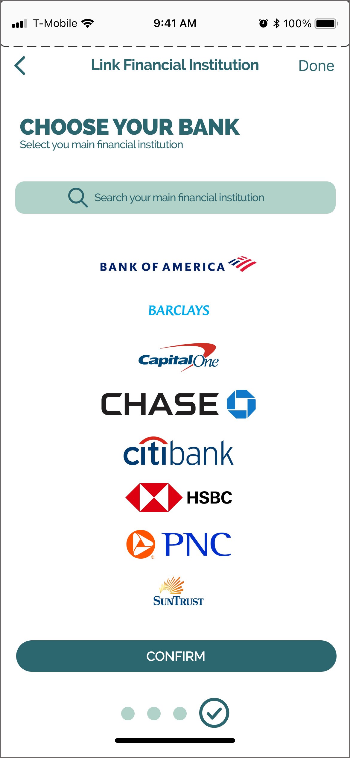
Our users are seeking an integrated solution that empowers them to not only save money and establish budgets but also receive personalized financial guidance and effortlessly track their expenses. The current fragmented setup presents numerous friction points and raises security apprehensions, underscoring the necessity for a comprehensive, all-in-one platform.
Style Guide


User Personas
After pinpointing the specific tasks users aim to achieve with a money-saving app, I developed two user personas informed by the gathered user stories. These personas are crafted to represent the app's typical users, guiding the design process to ensure it aligns with their needs and preferences.

User Flow
This initial user flow is crafted from user personas and the goals the users want to accomplish, forming the blueprint for design decisions. It outlines the sequential steps users take to accomplish their tasks within the interface, ensuring a cohesive and intuitive user experience.

Lo-Fi Wireframes
I initiated a series of Crazy 8s sketching sessions to rapidly generate multiple design concepts. After several iterations, I produced a set of low-fidelity paper screens. In this instance, I employed a mobile-first design strategy, aligning with the design brief that specified users frequently making purchases from various locations such as their homes, cars, or workplaces

Initial Mid-Fi Wireframes
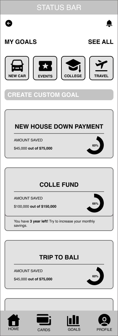
I transformed my initial paper prototypes into mid-fidelity counterparts. Adhering to a grayscale color scheme, the design prioritized functional elements over aesthetics. This phase aimed to transition the paper prototypes into a testable digital format. The primary focus centered around three pivotal features: setting savings goals, monitoring expenses, and integrating financial literacy resources.


BEFORE USABILITY TEST


Hi-Fi Wireframes


Final Mockups


User Feedback
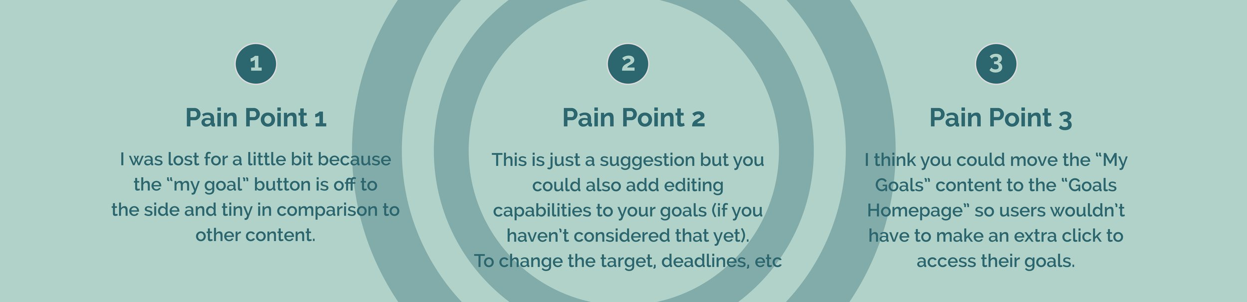
I developed a series of mid-fidelity wireframes as a foundation for prototyping, aiming to refine the user journey by identifying any usability concerns through effective user testing. This process was crucial for observing how potential users interact with the interface, and to pinpoint any friction points that could disrupt their experience.
The user feedback on the prototype was largely positive, particularly regarding the layout, navigational flow, and the use of visual cues that effectively communicated progress towards users' goals. Nonetheless, my primary focus was on gathering and addressing constructive feedback to further optimize the user experience.
New Mid-Fi Wireframes
Based on user feedback, I optimized the navigation to the "Goals" screen for fewer steps and clearer UI communication about selecting predefined goals. I reduced interactions, removed redundant elements like the "select the goal you want to achieve" text and "Add Goal" button, and added a placeholder for custom goals. These changes enhanced the user experience by making it more intuitive and streamlined.


AFTER USABILITY TEST


Reflections
Conducting usability tests during the UX phase proved invaluable for evaluating the intuitiveness of the paper prototype among first-time users. It affirmed that I'm crafting an app characterized by simplicity and effectively addresses users' goals and pain points. These insights were pivotal in informing critical design decisions. Developing a comprehensive and user-friendly style guide, which standardized typography, colors, iconography, and all UI elements, facilitated the creation of app screens with a cohesive and polished appearance. This ensured consistency throughout the design process and streamlined the user experience.
The iterative process of rapid prototype sketching posed a notable challenge during the UX phase. Despite this hurdle, the repetition proved instrumental in gaining insights into user navigation patterns on mobile screens, leading to enhancements in usability.
Additionally, multiple iterations of the user flow diagram were necessary to refine the structure and achieve a version that prioritized simplicity and intuitive navigation. This iterative approach ensured that the final user flow effectively guided users through the app's functionalities easily.
Next Steps
An early emphasis on addressing user needs will enable me to define the project's scope accurately and craft an optimal user flow. Persistently gathering feedback from potential users and conducting usability tests, even during the later stages of the UI development, will facilitate continual refinements to the app’s design and functionality, ensuring a superior end product.