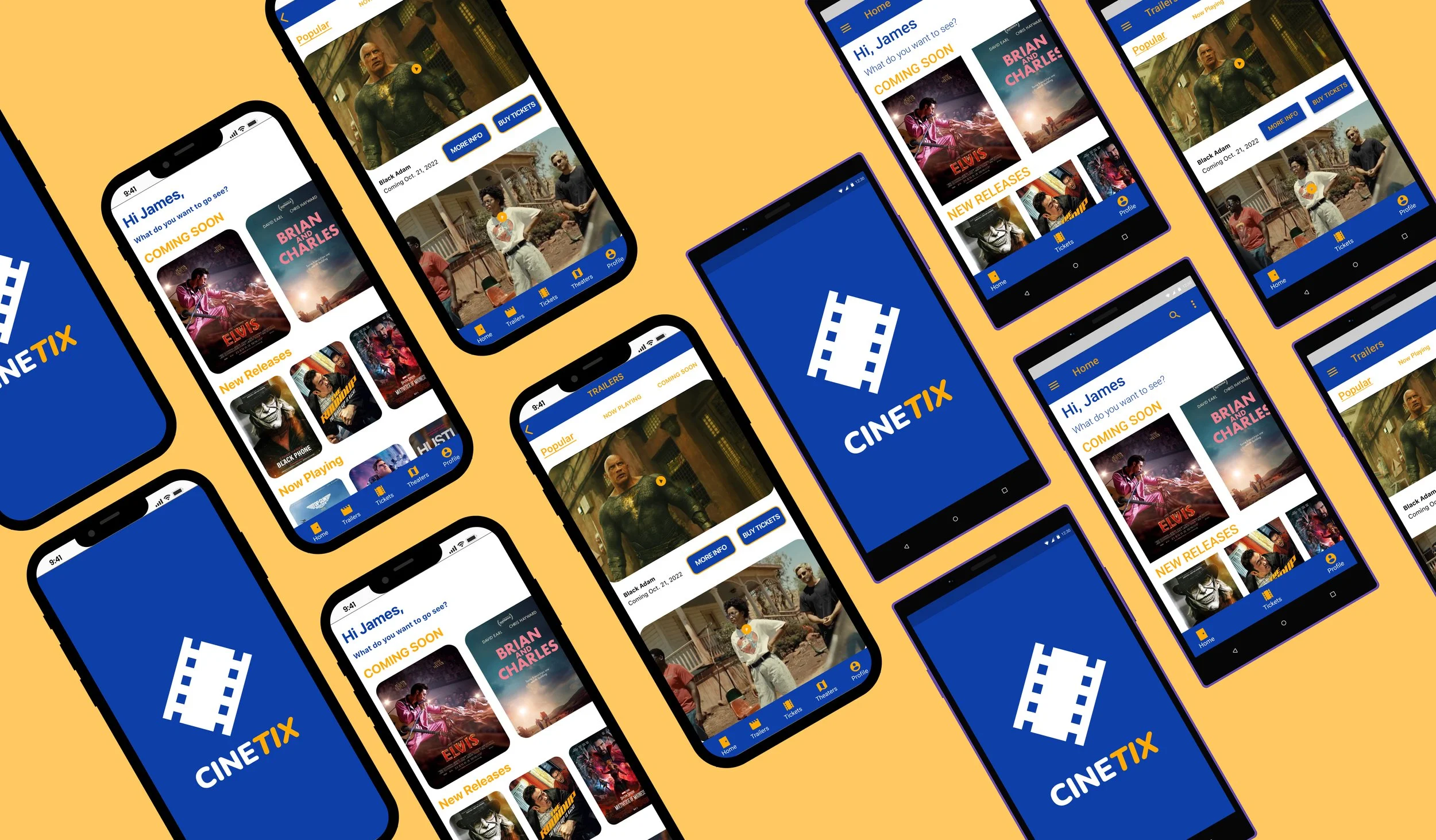
Overview
Going to the movies is a popular pastime, but the process of planning and organizing a movie outing can often be cumbersome and time-consuming. From finding showtimes and booking tickets to managing concessions and coordinating with friends, the traditional movie-going experience can be fraught with hassles that detract from the overall enjoyment.
Project Duration
4 Weeks
My Role
UI/UX Designer
UI/UX Research
Tools
Figma, Photoshop
Adobe Illustrator
Goals and Objectives
CineTix aims to revolutionize the movie-going experience with an intuitive and engaging native iOS and Android app. Our objective is to create a highly intuitive and visually engaging platform that consolidates ticket purchases, snack orders, and all related activities into a single, user-friendly interface. By streamlining these processes, CineTix ensures a seamless and enjoyable cinema visit, enhancing user satisfaction and making every aspect of the cinema experience more convenient and immersive.
Challenge
Moviegoers today seek convenience, efficiency, and enhanced experiences in their leisure activities. They desire a seamless way to plan and enjoy their movie outings without the frustrations of long queues, sold-out shows, and uncoordinated plans with friends. Current solutions often fall short, lacking integration and user-friendliness, leaving moviegoers longing for a better way to manage their movie experiences.
Design Process
Style Guide
Competitive Analysis
I conducted a competitive analysis of movie ticket buying apps which involved evaluating the user interfaces, user experiences, and feature sets of leading platforms. This analysis focused on identifying best practices in usability, navigation flow, visual design, and overall user satisfaction. By benchmarking against top competitors, we gained insights into effective design elements and user engagement strategies, which will inform and enhance the UI/UX design of CineTix.
User Flow
Based on the competitive analysis, I created a user flow map that provides a detailed overview of the user's journey, highlighting the steps needed to complete tasks and achieve their goals. This user flow map ensures a clear and intuitive navigation experience, guiding users seamlessly through the app's core functionalities.
Lo-Fi Wireframes
After conducting a competitive analysis, I identified key actions and developed low-fidelity wireframes for iOS and Android respectively to visualize the user flow. While designing the app, my limited experience with Android devices initially posed challenges. I had to account for Android-specific design elements, such as hamburger menus and device-integrated controls, which differ from iOS design conventions. This required careful consideration to ensure a consistent and intuitive user experience across both platforms.
iOS Lo-Fi Wireframes
Android Lo-Fi Wireframes
Added seating distinctions for the seat selecting step.
Added seating distinctions for the seat selecting step.
iOS additions after usability test
Added a booking summary step to follow the seat selecting step.
Android additions after usability test
Final Mockup
Hi-Fi Wireframes
Added a booking summary step to follow the seat selecting step.
iOS Hi-Fi Wireframes
Android Hi-Fi Wireframes
iOS Final Mockups
Wireframe Additions Following User Feedback
After thoroughly assessing and considering user feedback from the usability tests, several key additions were implemented to enhance the user experience. These improvements were carefully designed to align with user needs and preferences, ensuring more intuitive navigation and a more seamless interaction with the app. The changes focused on refining interface elements, streamlining user flows, and addressing any identified pain points, ultimately making the app more user-friendly and efficient in helping users achieve their goals.
User Feedback
After conducting a comprehensive competitive analysis and carefully designing the user flow, I developed initial low-fidelity wireframes to visualize the app's structure and navigation. I then conducted usability tests as part of user research to assess the effectiveness of the initial user flow. These tests aimed to determine if users could intuitively navigate the app and accomplish their goals, while also identifying any pain points or areas needing improvement. This iterative process ensured the design was both user-centric and goal-oriented, providing valuable insights for refining the app's overall user experience.
Added a map view to the movie and/or theater search.
Reflections
I believe I created an app that effectively addresses market needs by providing users with a valuable alternative in the movie ticket-buying space, filling existing gaps. The primary challenge was designing in accordance with Material Design guidelines, as my limited familiarity with Android devices made compliance difficult. Moving forward, I would invest more time in conducting thorough user research and exploring unique user flows to differentiate CineTix, highlight additional features, and enhance the overall design and user experience.
Next Steps
To further enhance CineTix, I will conduct comprehensive user research to gather deeper insights into user behaviors and preferences, which will inform the exploration of unique user flows. Additionally, I will focus on designing and integrating more features that align with user needs and differentiate the app in the market. Improving my understanding of Material Design guidelines will be a priority to ensure compliance and optimize usability on Android devices. These steps aim to refine the design and elevate the overall user experience.
Android Final Mockups
Added a map view to the movie and/or theater search.
Add a profile to home screen and reorganized bottom bar.


